Here comes a thought experiment; how would the latest set of AI tools with their multimodal functionality cope with analysing dashboard layouts against human-centered design principles? Could they generate recommendations on how to improve the visual flow of information?
My interest in this question came about when I first spotted Cole Naussbamer Knaptic’s book on storytelling with data on a colleagues desk at work, and then on further reading Kurt Buhler’s article on the 3-30-300 rule, which states that;
- users on a dashboard should get an overview of the most important question or areas within 3 seconds of opening a dashboard
- users should be able to filter and zoom to periods and categories within 30 seconds and,
- users should get details-on-demand to inform decisions and actions within 300 seconds.
This concept here is credited to work carried out by Ben Shneiderman, who studied visual information design. With that in mind, I downloaded a copy of a PBI dashboard overview page 1 taken from an online search, added some instructions 2, uploaded and tested using the latest models of Gemini, Claude and Perplexity.
I uploaded a screenshot of a Power BI dashboard. Please analyse the image and provide a critique based on the 3-30-300 rule:https://www.sqlbi.com/articles/introducing-the-3-30-300-rule-for-better-reports/. Summarise your analysis in a table.
2 Prompt Instructions
Dashboard Design
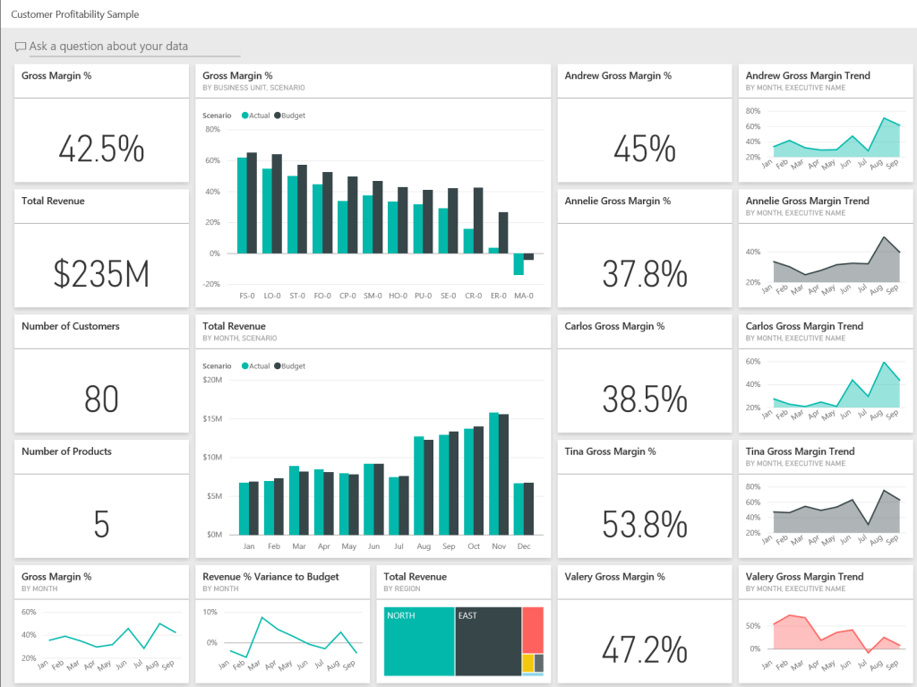
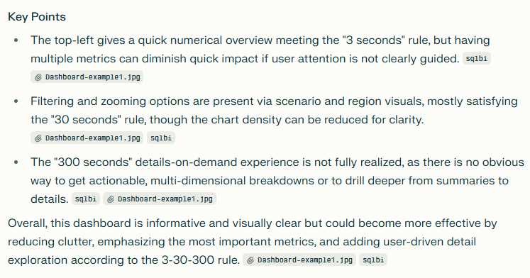
The dashboard has 4 visual components; KPI cards, bar charts, tree map and line charts. 4 high level metrics are displayed; KPI cards – Gross Margin (GM) %, Total Revenue, Customer count and Products; bar charts – Actual v Budget GM & Total Revenue monthly trends; and a tree map of revenue split by region.
Did it meet the 3-30-300 rule?
What I see;
- 3 secs – Gross Margin of 42% with revenue figure of $235m, taken from 5 products sold to 80 customers.
- 30 secs – Margins deteriorated over the past year, going from 60% to -20%, while revenue x3 in the second half of the year. Most revenues taken from North and East regions.
- 300 secs – Aggregate & individual gross margin KPIs for 4 individuals with 9-month trends charts, showing highest gross margins in the month of August.
Arguably, you could workout what the general narrative for the sales and margin performance is, however it’s hard to ignore the obvious flaw – 19 visual components is excessive. The lack of any date filter on the dashboard means it is not clear if the KPIs refer to month-to-date or year-to-date periods?
What do the models show?
I have summarised snippets from the results taken from all 3 models below:
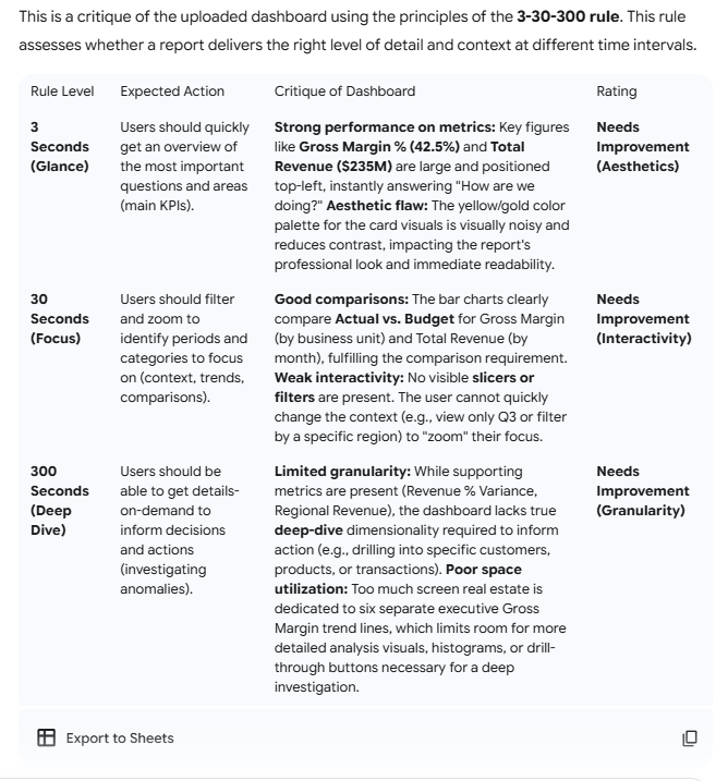
Claude (model: sonnet 4.5)
Claude calls out the lack of focus on the dashboard, recommends a redesign of the layout, failing it on the first 3-second rule and partially passing it on the latter 2 design criterias. The dashboard is clearly cluttered with data (lots of it) but with no slicers/filters to zoom, there is no way to easily find trends in different periods. The model does a good job in describing the shortfalls and in providing and prioritising recommendations to fix the layout including UX tips on making better use of colours.


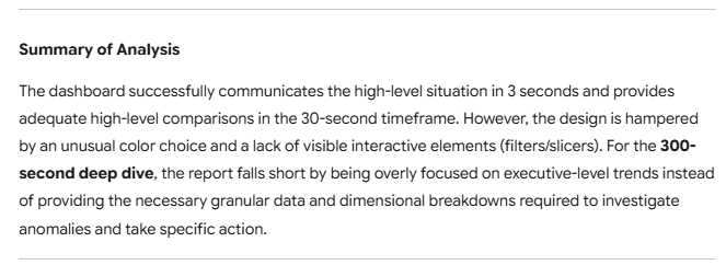
Gemini (model: 2.5 Flash)
Google’s Gemini model interestingly gives little weight to the high number of KPIs on display, but more concerned on how the colour palette affects readability of the data. Gemini scored the design highly on 3-second overview criteria but suggested improvements on the focus and deep-dives criteria. Similarly to Claude’s sonnet model, It highlights the lack of filters to zoom in on different time periods or categories and lack of detailed analysis to drive actions.
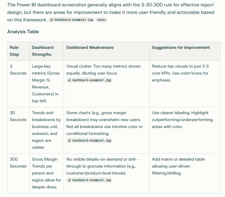
Perplexity
The results here mirror aspects of Gemini – too many visuals which creates a lack of focus and, Claude – no way to zoom in or filter data dimensions or categories. The dashboard scores ok in the first of our rules but like the other models, not so well on the other criterias.
…Closing thoughts…
It might be tempting to say that in the not-so-distant future, developers will rely on AI agents to design and critique their layouts, but in reality, that future is already here. The methods vary: some teams upload assets directly into agent-driven tools, while others build custom applications that connect to large language models via API. For large enterprises with well-established branding and communications kits, these assets can serve as foundational criteria to complement the visual design best practices discussed in this article.

Leave a comment